

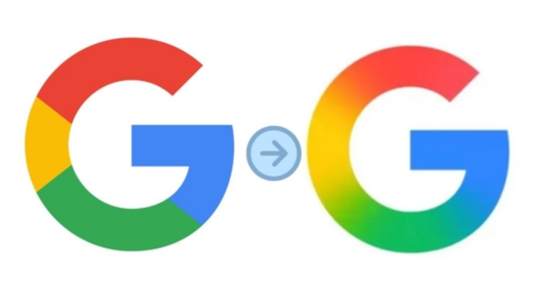
In a subtle yet significant move, tech giant Google has updated its iconic ‘G’ logo for the first time in ten years. The change, while not a radical redesign, introduces a slightly refined and more modern aesthetic to the globally recognized symbol. This update reflects Google’s ongoing evolution and its commitment to a consistent brand identity across its ever-expanding suite of products and services.
The most noticeable alteration lies in the letterform itself. The new ‘G’ appears slightly bolder and more geometric, with a subtly adjusted curve. This gives it a cleaner and more contemporary feel compared to its predecessor. While the core four-color palette – blue, red, yellow, and green – remains unchanged, the individual colors might also see minor adjustments for better vibrancy and consistency across digital platforms.
This logo refresh isn’t a complete overhaul, aligning with Google’s history of iterative design changes. The company has opted for evolution rather than revolution, ensuring that the logo remains instantly recognizable to billions of users worldwide. This approach minimizes any potential confusion and maintains the strong brand equity associated with the familiar ‘G’.
The previous major redesign occurred in 2015 when Google transitioned to its current sans-serif wordmark and introduced the now-familiar four-colored ‘G’ as a compact identifier. This move was part of a broader effort to create a more flexible and adaptable visual language that could work seamlessly across various screen sizes and contexts. The latest update builds upon this foundation, further optimizing the ‘G’ for modern digital interfaces.
While Google has not issued a formal press release detailing the specific reasons behind this subtle change, it is likely driven by a desire for enhanced clarity and legibility, particularly on smaller screens and wearable devices. The slightly bolder form ensures better visibility, while the refined geometry contributes to a more polished and modern appearance.
The updated ‘G’ is expected to be rolled out gradually across Google’s products, services, and marketing materials. Users may start noticing the change on their smartphones, tablets, laptops, and other devices in the coming days and weeks. This consistent visual identity reinforces Google’s presence in the digital landscape and strengthens its brand recognition.
This minor logo update comes at a time when Google continues to innovate and expand its offerings in areas like artificial intelligence, cloud computing, and hardware. The subtle refresh of its core logo serves as a visual reminder of the company’s ongoing evolution while retaining the familiarity that users have come to trust over the past two decades. It’s a testament to the power of subtle design changes in maintaining relevance and a contemporary feel for a global brand.
The design world will undoubtedly scrutinize the nuances of this update, but for the average user, the change will likely be a seamless transition, reinforcing the ever-present and recognizable Google ‘G’ in their daily digital interactions. This quiet evolution underscores Google’s understanding of its brand’s immense value and its careful approach to visual identity.


Leave a Reply